


There’s been a lot of wild speculation surrounding gold’s bullish run. When you consider a gold investment, you’re likely to think of the more common factors that come into play: inflation, geopolitical uncertainty, and central bank demand.
But there’s more to the mix now, especially in light of the Trump administration’s latest initiatives and policies. These new developments are spurring speculations that are likely to change the context surrounding how investors view gold. Here are a few key things to think about:
- Around 12.5 million ounces of gold have been imported into the US since last November.
- President Trump announced a possible audit of Fort Knox gold reserves which hasn’t been done since the early 1970s (is it all still there?).
- The US government’s gold valuations remain at an outdated $42.22 an ounce.
The big rumor (keyword: rumor) is that gold is due for a revaluation. Will Trump use the revaluation to boost the value of the Treasury’s holdings, possibly paying down the national debt? Will his administration attempt a partial return to the gold standard? Will the gold be used to counter China’s reported attempt at launching a gold-backed currency to challenge the US dollar?
Whatever the case may be, a full revaluation is likely to drive bullish sentiment in gold, sending prices higher. If the government sells gold to weaken the dollar, you can expect some short-term price dips before a rebound. And if, by any chance, the Fort Knox audit reveals a shortfall, then that’s bad news for the economy and markets but good news for gold, which will likely send prices skyrocketing.
To get some near-term context, let’s see how gold has been performing over the last year relative to silver, commodities in general, and the S&P 500.

FIGURE 1. PERFCHARTS OF GOLD, SILVER, COMMODITIES MARKETS, AND THE S&P 500. Gold and silver outperformed both the broader stock and commodities markets over the past year. Chart source: StockCharts.com. For educational purposes.
It turns out that both gold and silver have been outperforming the broader equities and commodities markets.
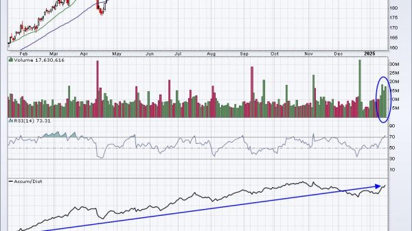
Let’s take a long-term view of gold. Below is a weekly chart.
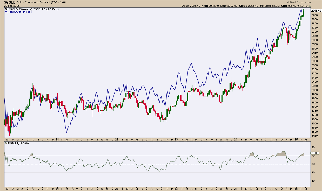
FIGURE 2. WEEKLY CHART OF GOLD FUTURES. There are no signs of topping yet, though its ascent has grown increasingly steep. Chart source: StockCharts.com. For educational purposes.
If volume precedes price, then accumulation, as shown by the Accumulation/Distribution Line (ADL) on the chart, has stayed well ahead of it for a little over three years. Momentum-wise, the Relative Strength Index (RSI) may be registering as “overbought” but the reliability of this indicator in the current environment is anyone’s guess.
Trump’s policy blitz is transforming the political and economic landscape, and it brings certain shocks that can make technical and fundamental analysis more fluid. For now, there are no clear signs of topping, which makes it difficult for anyone interested in finding an entry point. So, let’s zoom in on a daily chart.

FIGURE 3. DAILY CHART OF GOLD. There are still no signs of a top except for the declining buying pressure indicated by the Chaikin Money Flow indicator. Chart source: StockCharts.com. For educational purposes.
There are still no clear signs of near-term weakness, aside from a slight drop in buying pressure indicated by the Chaikin Money Flow (CMF). If gold pulls back, the $2,900 high will likely serve as the first support level. Additional support zones, marked by the magenta lines, align with key swing highs and lows based on the Zig Zag lines.
The final three levels define a broad trading range and coincide with the Volume by Price indicator, highlighting areas of concentrated trading activity where support is most likely to hold. If prices retreat, these levels will be crucial to watch for a potential rebound. So, right now, it’s a matter of waiting for a pullback.
Silver is another asset that has outperformed commodities and the broader market. Might the grey metal present a tradable opportunity? Below is a daily chart to consider.
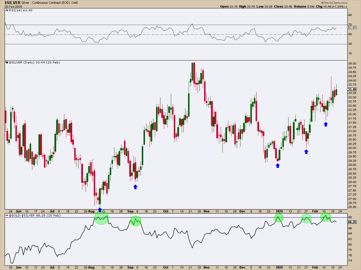
FIGURE 4. DAILY CHART OF SILVER. The grey metal has room to run but watch your entry point. Chart source: StockCharts.com. For educational purposes.
The RSI indicates that silver has more upside to go before reaching an overbought level. Note the relative performance window that I plotted in a manner that replicates the well-known gold/silver ratio (lower panel) .
Historically, this ratio has averaged around 65:1 since the 1970s, meaning it typically takes 65 ounces of silver to equal the value of one ounce of gold. Note that every time the ratio reaches the 90-line silver tends to rally.
Silver is currently rallying, but is another entry point on the horizon? Possibly, but patience is key. This relative performance setup highlights the value of the gold/silver ratio in identifying potential silver entry points, whether for short-term trades or long-term positions.
At the Close
Monitor “spot” $GOLD and $SILVER by adding them to your ChartLists. However, you may be interested in entering trades using their ETF equivalents in GLD and SLV. The prices will differ from their spot price, but the chart patterns that define your entry will be highly correlated, given a few slight adjustments.

Disclaimer: This blog is for educational purposes only and should not be construed as financial advice. The ideas and strategies should never be used without first assessing your own personal and financial situation, or without consulting a financial professional.